ggplot
Warning
Installing and loading ggplot2 on webR takes a little while. The install is happening in the background. Don’t worry, once you’ve waited to load the package everything else will be quick.
ggplot
- Very popular plotting package
- Good plots quickly
- Declarative - describe what you want not how to build it
- Contrasts w/Imperative - how to build it step by step
Basics
- Load the package and some data
- To build a plot using
ggplotwe start with theggplot()function
ggplot()creates a base ggplot object that we can then add things to - like a blank canvas- We can also add optional arguments for information to be shared across different components of the plot
- The two main arguments we typically use here are
data- which is the name of the data frame we are working with, soacaciamapping- which describes which columns of the data are used for different aspects of the plot- We create a
mappingby using theaesfunction, which stands for “aesthetic”, and then linking columns to pieces of the plot - We’ll start with telling ggplot what value should be on the x and y axes
- Let’s plot the relationship betwen the circumference of an acacia and its height
- This still doesn’t create a figure, it’s just a blank canvas and some information on default values for data and mapping columns to pieces of the plot
- We can add data to the plot using layers
- We do this by adding a
+after the theggplotfunction and then adding something called ageom, which stands forgeometry - To make a scatter plot we use
geom_point
- To change things about the layer we can pass additional arguments to the
geom - We can do things like change
- the
sizeof the points, we’ll set it to3 - the
colorof the points, we’ll set it to"blue" - the transparency of the points, which is called
alpha, we’ll set it to 0.5
- the
Try changing these values to make the graph look like you want it to
To add labels (like documentation for your graphs!) we use the
labsfunction
Grouping
- Group on a single graph
- Look at influence of experimental treatment
Try changing the above code to color based on the
gearWe can also split each group into different subplots (known as facets)
- Try changing this code to create a subplot for each value in
vswith points of size 4
Exercise
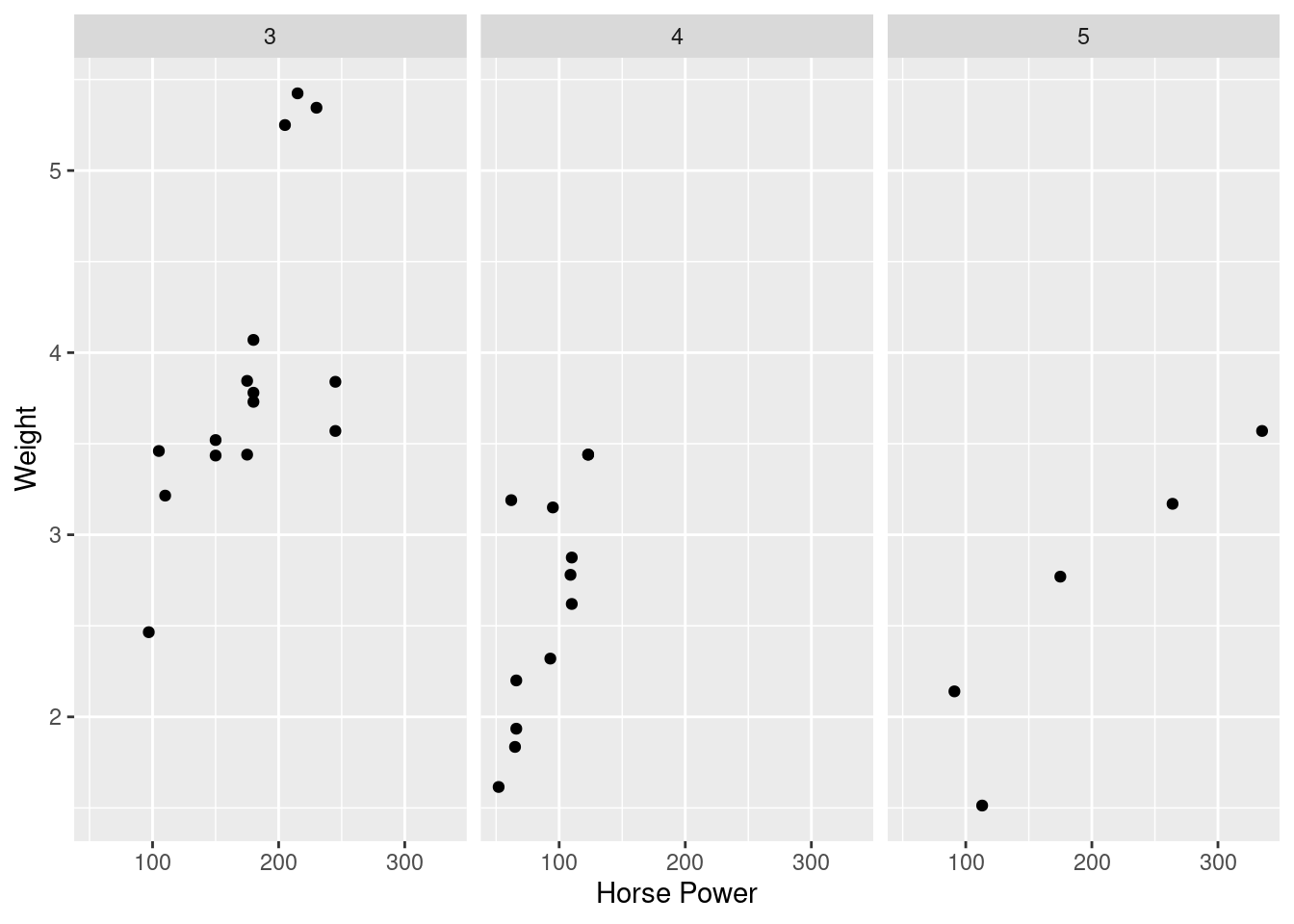
Make a scatter plot with hp on the x axis and wt on the y axis. Label the x axis “Horse Power” and the y axis “Weight”. Make one subplot for each value in gear.
Your result should look like the plot below
Expected Result
Solution Code
library(ggplot2)
ggplot(mtcars, aes(x = hp, y = wt)) +
  geom_point() +
  labs(x = "Horse Power", y = "Weight") +
  facet_wrap(~gear)